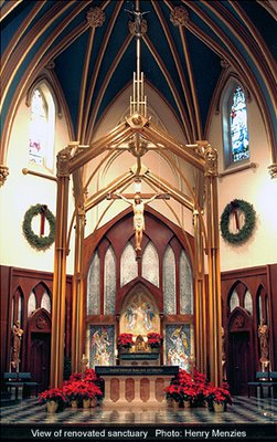
If, like me, your heart just breaks to see the many new Catholic cathedrals and churches that look more like airport lounges, concert halls, or clean rooms; or to see fine old cathedrals and churches get the sacred renovated completely out of them; then you should definitely spend some time at The Institute for Sacred Architecture. You'll feel better, I promise!
Take a look, for instance, at the renovation of the Cathedral of St. Augustine in Bridgeport, Connecticut, featured on the homepage. I hadn't heard of the architect, Henry Menzies, but I'm sure going to keep an eye on him now. Look at the baldacchino over the altar in the photo -- a very traditional element interpreted in a thoroughly contemporary way, beautifully and respectfully done.
I like the sound of this:
The centerpiece of Mr. Menzies’ design is the altar, which is, without a doubt, the crowning aspect of the project. The altar is the focus of the church, and the eye is invariably drawn to it from almost any point in the cathedral. The color scheme and floor patterns chosen by Mr. Menzies accentuate the altar’s importance and help to focus the eye. The color scheme inside consists of very pale walls and columns, highlighted by gold capitals. The eye is drawn from the capitals along the ribs of the nave ceiling. The ceiling is painted blue, reminiscent of color schemes of the Renaissance. The ceiling represents heaven, often painted blue to portray the heavens within the structure of the church. The attention is then gathered at more highly colorful areas of the church, such as the altar and side chapels.
The centerpiece is the altar -- AND it's in its proper place. The whole atmosphere is one of quiet, beauty, and reverence. I love the colors.
You could really get excited about going to Heaven in a place like that.
